Stop-N-Store Self Storage Rebrand
Secure. Modern. Recognizable.
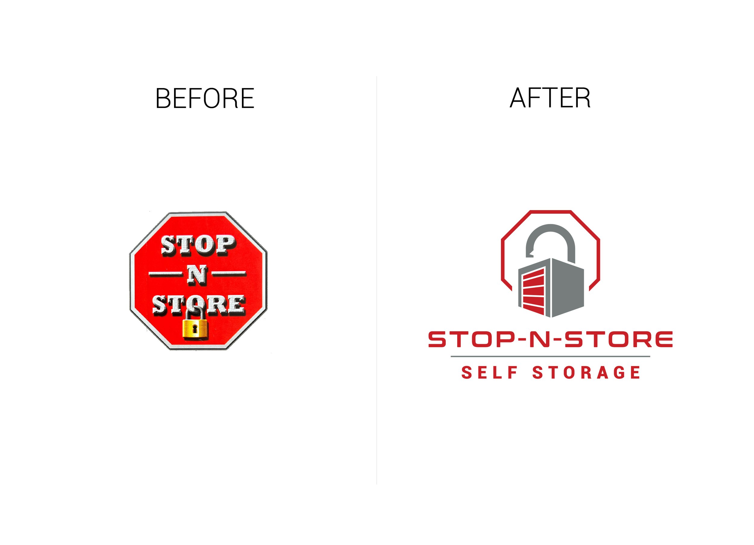
Stop-N-Store approached us with a strong local reputation but a dated visual identity that no longer aligned with their position in the self-storage industry. The original logo centered around an over-stylized stop sign, which didn’t clearly communicate the brand’s core value: secure, reliable storage.
The strategy behind the rebrand was to highlight what matters most to their customers—trust and security. We shifted the visual focus from the stop sign to a lock symbol, creating a modern, clean logo that feels professional, approachable, and instantly recognizable.
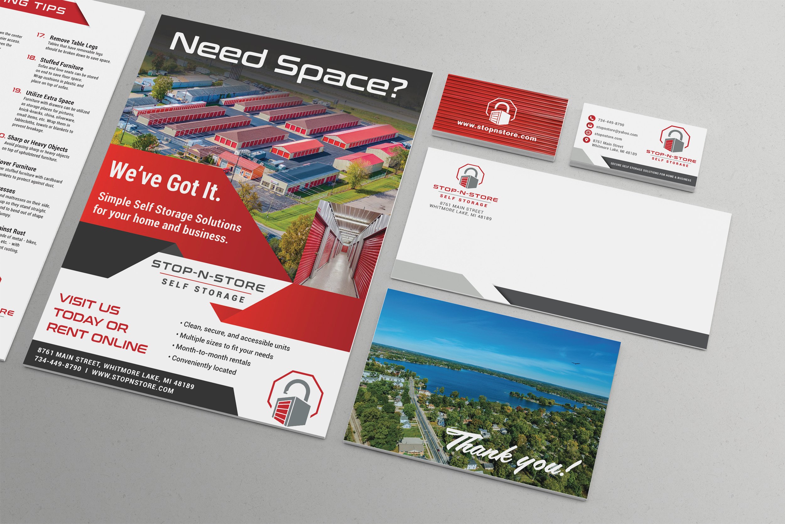
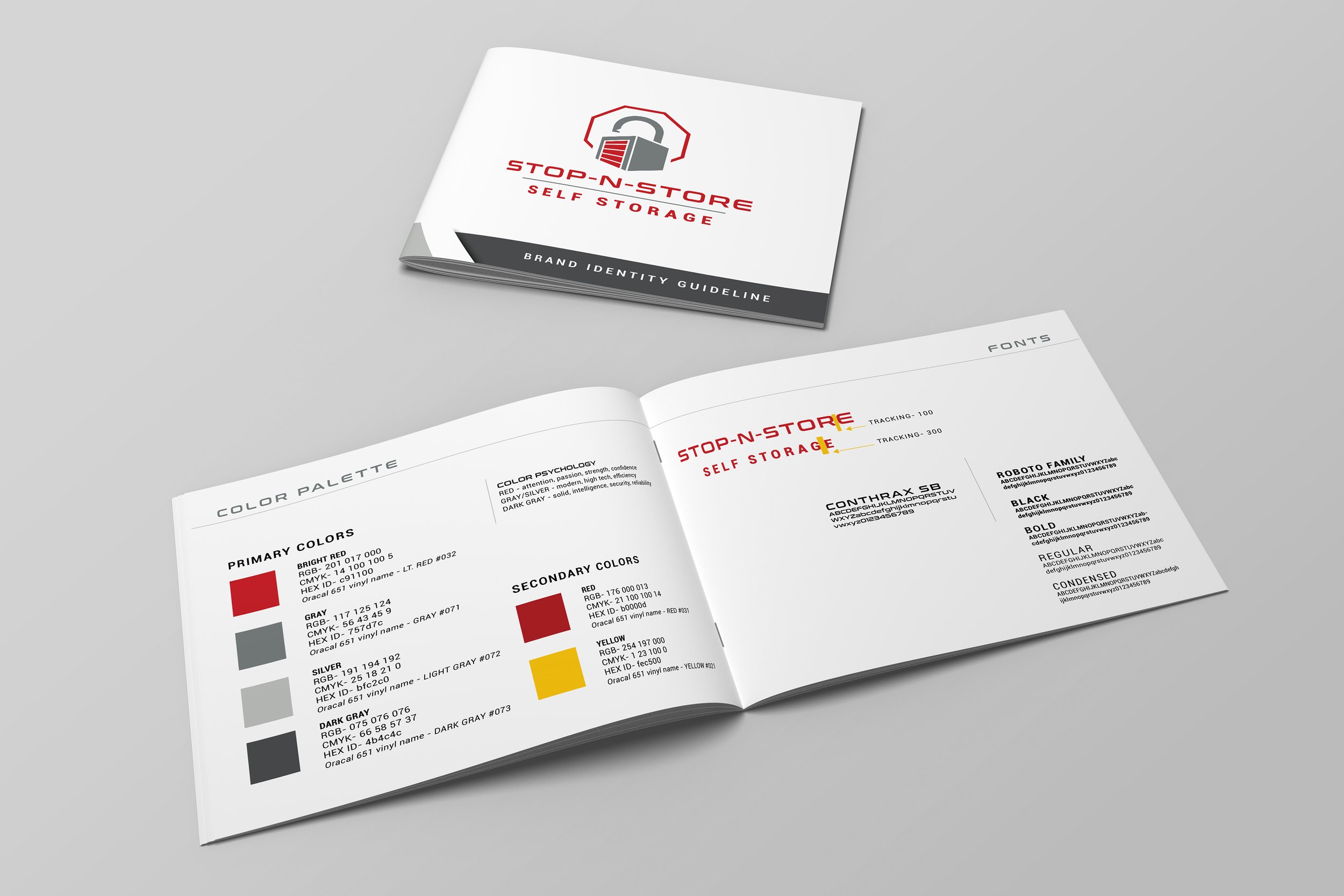
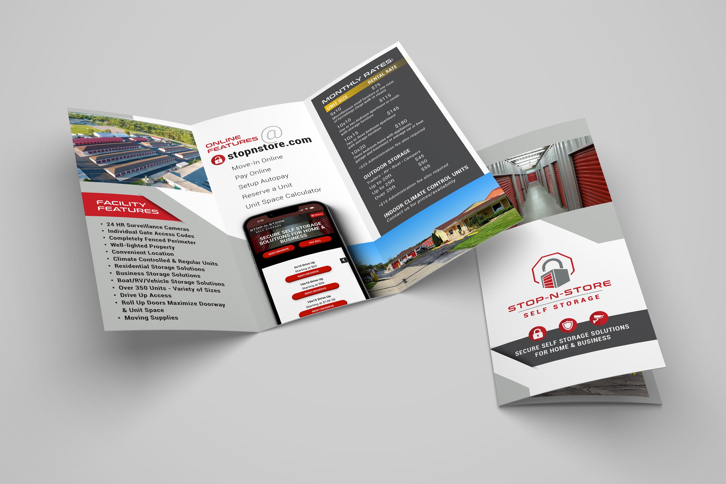
From typography and color palette to signage and marketing materials, the entire brand system was reimagined to reflect Stop-N-Store’s evolution while honoring its roots. The result is a cohesive, updated identity that builds customer confidence and sets the brand apart in the competitive self-storage market.