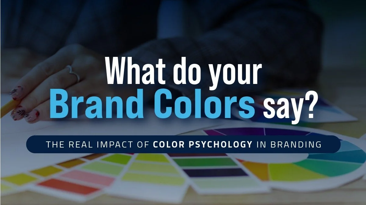
What Do Your Brand Colors Say?
Learn how color psychology in branding influences customer perception and how to choose a strategic brand color palette that builds trust and attracts the right audience.
Your brand colors speak before your words do.
The Real Impact of Color Psychology in Branding
I’ve been fascinated with color since I was a kid. Most of my free time went into crayons and coloring books. When I would paint, I got more joy out of mixing colors than creating the actual artwork. Even as an adult, I still love color. I don’t want to say I’m obsessed, but… you get it.
Color is everywhere in our daily lives, and it affects us way more than we realize.
Color psychology, especially in when it comes to branding, looks at how color influences emotion, perception and buying behavior. In marketing research, people tend to form quick impressions, and color plays a big role in that.
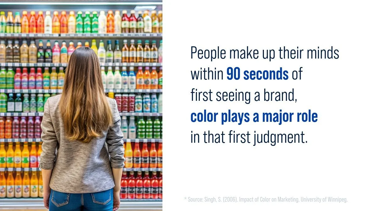
One widely cited finding is that people make up their minds within about 90 seconds of their first interaction with a brand, and roughly 62% to 90% of that assessment can be based on color alone.*
First impressions happen fast, and color does a lot of the talking.
That’s why your brand color palette should be a strategic decision, not just a list of colors you like.
Color shapes how people feel about your brand
Your colors can attract the right audience or push them away. They can instantly communicate your personality, or create mixed signals.
Before choosing your palette, ask yourself:
• What emotions do I want people to feel?
• What is the personality of my brand?
• Do my colors support or fight against my message?
• What colors are common in my industry?
• How do I stand out while still feeling “right” for my audience?
Your palette is doing a lot more heavy lifting than most people realize. A strong brand color strategy helps your audience understand your brand faster and builds trust from the first impression.
Here’s an example: Stop-N-Store
When we worked on a brand identity design and rebrand for Stop-N-Store, a self-storage facility, color was one of the first things we had to rethink. Their original branding used red as the dominant color because of the word “Stop” in the name (and the obvious stop sign connection).
The issue is that red can come across as intense, alarming, or overly emotional. For a storage company, it might not seem like brand color matters, but it absolutely does. People choose storage when they’re already in a stressful moment (moving, renovations, life changes). Their goal was to build trust and reassure customers that their belongings would be safe in a clean, reliable facility with modern security upgrades. A bold red base was sending the opposite vibe.

Same brand, different message: shifting red from primary to accent makes the brand feel more secure and modern.
Red has benefits, don’t get me wrong. Instead of removing it completely, we shifted red into an accent color. Then we introduced neutral shades like gray and silver to create a stronger foundation that felt more secure, stable and modern. Red still had a place in the palette, but it became a highlight instead of the main voice.
That one change helped the brand better match the feeling they wanted customers to have. We also gave the logo a much needed update, but that’s a story for another day.
Your palette is part of your message, not just the packaging.
Why this matters for your brand
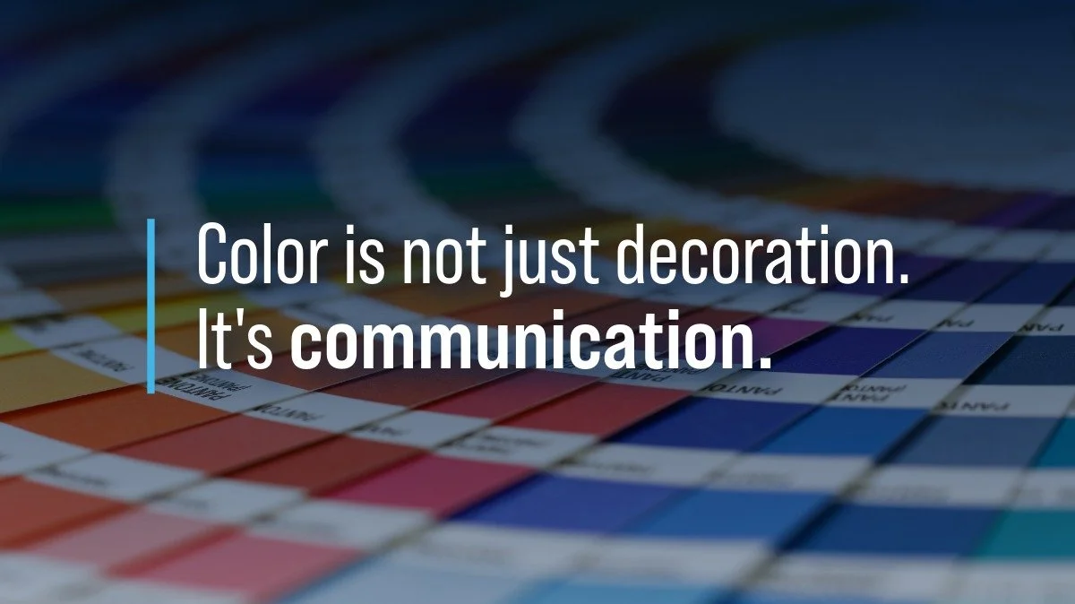
Color is not decoration. It’s communication.
Your palette tells people who you are before they read a single word. It can suggest luxury, approachability, energy, calm, tradition, or innovation. It can make your brand feel trustworthy or chaotic. It can help you stand out, or blend in. Choosing the right brand color palette is one of the most effective ways to shape how people perceive your business.
When your colors match your message, everything gets easier. Your website, packaging, social media, and logo start to feel more cohesive and intentional.
Also worth noting: color associations can vary by context and culture, so the “best” palette depends on who you’re trying to reach and where.
Final thoughts
Before you choose your brand colors, think about the meaning of colors in branding and the message you want to send. Just because you love a color doesn’t mean it’s the best choice for your business.
Color psychology is one of the simplest ways to strengthen your brand. When you choose with intention, your audience can feel it.
If you want help building a palette that fits your brand’s personality and goals, I’m always happy to help.
* Source: Singh, S. (2006). Impact of Color on Marketing. University of Winnipeg. https://newion.uwinnipeg.ca/~ssingh5/x/color.pdf

Why Aerial Images Catch More Attention Than Ground Photos
We break down the data behind why drone shots stand out and how they can elevate your content
.

Birds Eye view of residential property for real estate listing
We’re surrounded by visual content every day. With so many images competing for attention, how a photo is taken can make all the difference. Whether you’re sharing real estate listings, showcasing a venue, or promoting a local business, aerial imagery offers a unique perspective that helps you stand out.
Here’s a closer look at why aerial content tends to perform better than traditional ground-level photos:
⸻
1. Aerial Images Naturally Stand Out
Our brains process visuals incredibly fast—just 13 milliseconds, according to MIT. That’s all the time it takes for someone to notice and react to an image.
(Source: MIT News)
Because aerial shots offer a view people don’t usually see, they naturally draw more attention. One study found that using aerial images can increase engagement by up to 83%.
(Source: Imgix)
⸻
2. Better Performance on Social Media
Drone videos and photos perform especially well online. In fact, video posts generate up to 1200% more shares than posts with just text and images.
(Source: Bertey)
When someone scrolls through a feed full of similar photos, an aerial view immediately stands out and invites a second look.
⸻
3. They Show the Full Picture
In industries like real estate or tourism, it’s often hard to capture the full context of a space from the ground. Aerial images can give viewers a better understanding of layout, size, and surroundings. According to one study, homes with aerial shots sell up to 68% faster than those without.
(Source: Digital Camera World)
That added context builds trust and makes your listing or location more memorable.
⸻
4. A Unique Way to Stand Out
With so much content out there, it’s not easy to grab people’s attention. Aerial imagery offers a new perspective that helps your photos or videos feel more dynamic and professional—without overdoing it.
⸻
Thinking About Adding Drone Shots?
If you’re considering using drone photos or video in your next project, it’s a great way to level up your visuals. At Aeras Creative, we offer aerial imagery for golf courses, real estate, events, small businesses, and more. We focus on capturing meaningful visuals that tell a story and show your space in its best light.
⸻
Sources:
1. MIT News. “In the Blink of an Eye”, 2014
2. Imgix. “The Power of Images in Real Estate”, 2024
3. Bertey. “Video Marketing Statistics (2024)”, 2024
4. Digital Camera World. “Drone Photos Will Help Sell a Home 68% Faster”, 2024