Aeras Creative —Brand Identity Design
Of course we branded ourselves.
When we launched Aeras Creative, we knew we needed a brand identity that reflected both sides of our work: bold, thoughtful design and elevated aerial imagery. Creating our own brand wasn’t just a design exercise, it was an opportunity to define who we are, how we work, and the kind of clients we want to attract. And naturally, we held ourselves to a high standard.
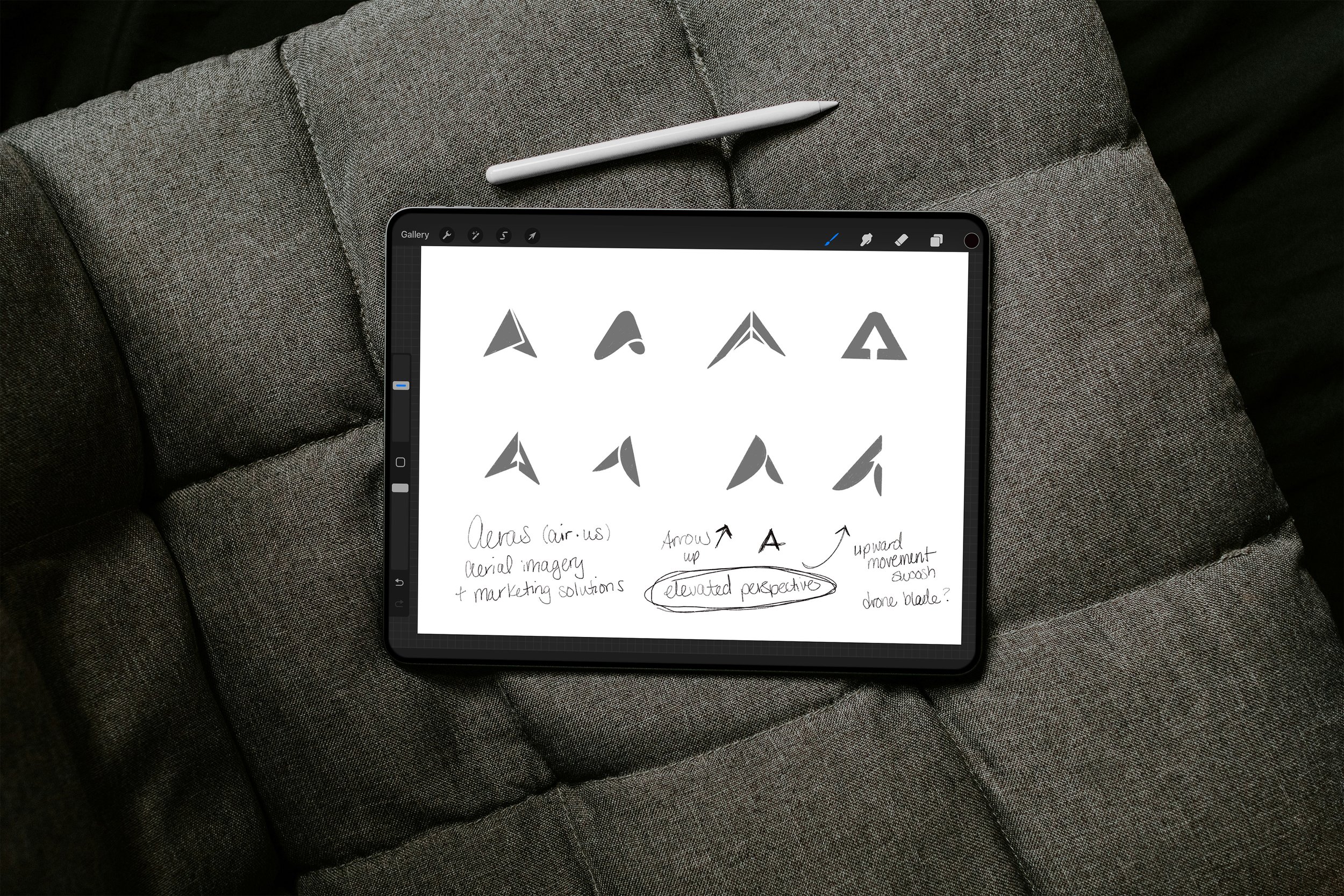
The name Aeras (from the Greek word for “air”) felt like the perfect fit — grounded in our drone work, but broad enough to encompass our creative services. We paired it with a modern visual identity built around movement, elevation, and clarity. The logo mark forms a subtle “A” while doubling as an upward arrow, symbolizing progress and perspective. It also reflects the motion of a drone ascending, a direct nod to what sets us apart.
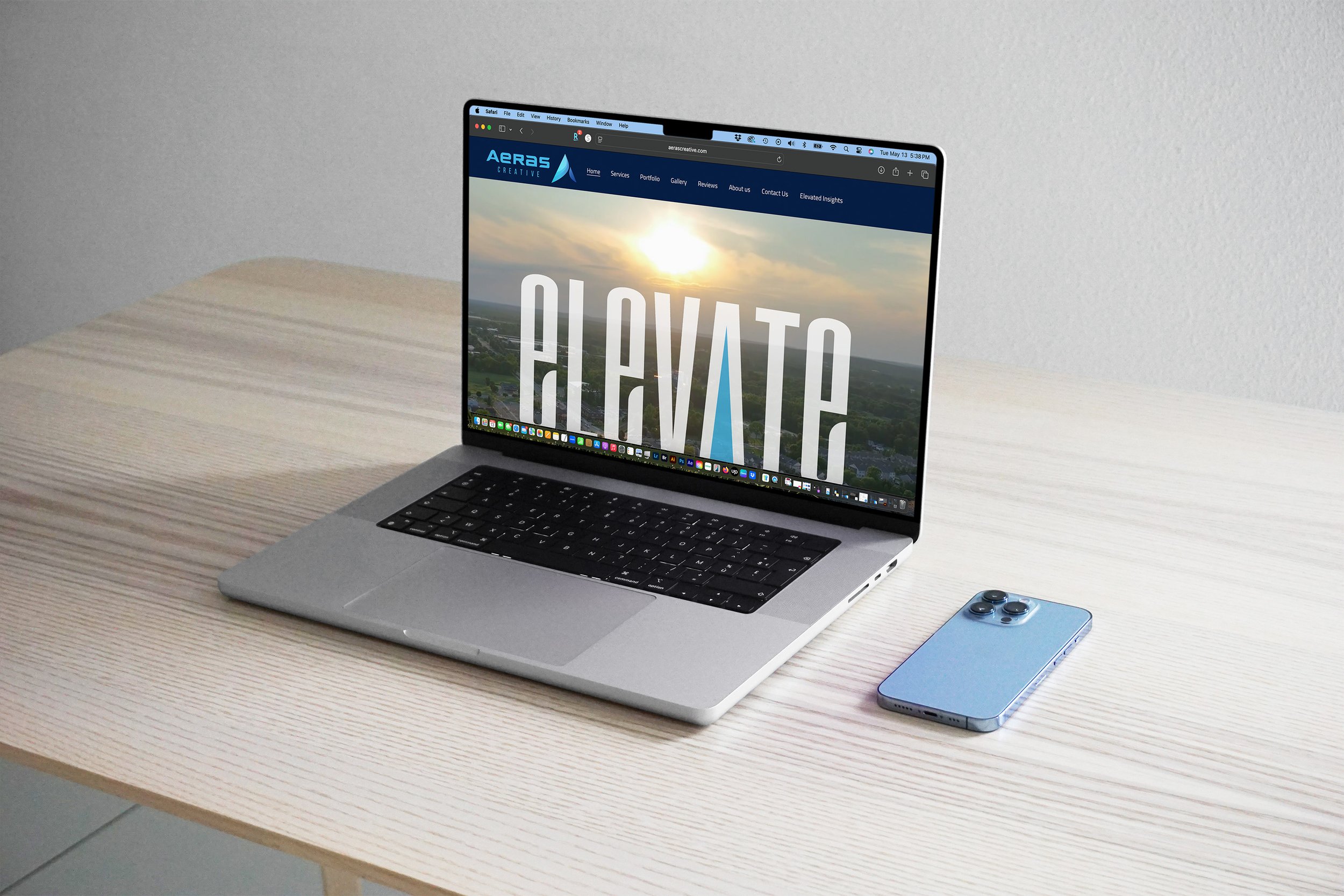
Our color palette is rooted in sky-inspired blues and sophisticated grays, designed to communicate trust, calm and innovation. The typography is clean and modern, chosen to create a sense of professionalism without feeling too corporate. Altogether, the identity feels elevated, flexible, and distinctly ours.
This brand gave us more than a polished look. It gave us confidence and clarity. It set the tone for how we show up, how we speak, and how we connect with clients. Designing our own identity helped us tell our story with intention, and that’s exactly what we aim to do for others.